Home > Presentation Concepts > Presentation Ideas> Visual Slide Mistakes
Here are 9 common mistakes presenters make when trying to make more visual slides.
A good slide reinforces the talk of the presenter. It supports them with visuals.
Here are 9 Top mistakes presenters make when creating ‘visual’ slides.
1. Using pictures that say exactly what the words do.
Issue: They add no value.

Solution: Use insightful pictures that add value or use graphs instead.
2. Using clichéd Clipart
Issue: They bring down the value and credibility of your content

Solution: Use professional photos, diagrams or icons.
3. Using photos not connected to the presentation
Issue: They just distract your audience.

Solution: Simple dots and arrows can convey far more meaning than unrelated images!
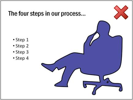
4. Using images of people without reason.
Issue: Audience attention gets hijacked by the images

Solution: Use relevant silhouettes or icons where appropriate
5. Cluttering!
Issue: Audience struggles to process too much information in one go.

Solution: Simplicity adds power to your message! Use visual “chunking” to the group and simplify.
6. Using pictures for decoration.
Issue: Your slides may be remembered, but the message won’t be.

Solution: Visuals are not an after-thought! They need to convey insights.
7. Don’t use facts when you want to convey emotions!

Solution: Use a relevant photo to connect with the emotions of your audience.
8. Using default templates
Issue: It says, “You don’t care enough to customize or go beyond”.

Solution: If you have something interesting and different to say, let your slides reflect that!
9. Too much variety in look and feel of slides
Issue: Audience grows tired reorienting themselves for each slide. It also looks unprofessional.

Solution: Use a consistent look & feel so your audience is focused on the message.
Solution to all these issues: 750+ PowerPoint Charts & Diagrams CEO Pack with pre-designed business concepts, models, charts graphs.
Here are some interesting and insightful templates from the CEO Pack. You can visit the sections to see more. The 750+ charts in the CEO Pack is a great collection to add to your business presentation resources:
Visual timeline diagram
Visual Editable Chart
Visual Puzzle Concept
All the above templates are from the CEO Pack and are surprisingly easy to edit. You just need to choose a relevant template, and replace sample text and images with your own. Why waste time creating these diagrams and adding animations from scratch, when you have such useful solution available off the shelf?


