Home > Presentation Design > Slides in Presentation
One of the questions that I get asked quite a lot in my workshops is – what is the ideal number of slides in a presentation.

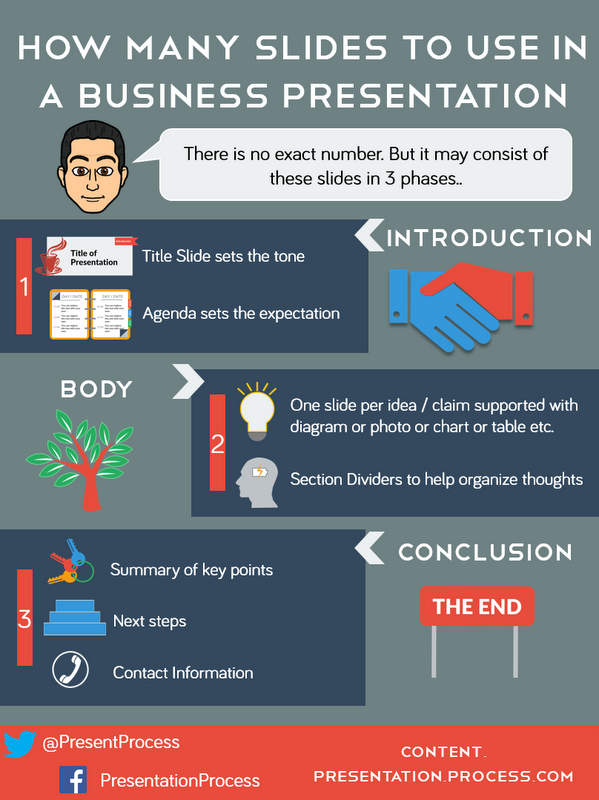
Unfortunately, it is not easy to prescribe an exact number of slides you should use. It would depend on the nature of your presentation. However, it is possible to suggest the places where you may use slides during the introduction, body and conclusion phases of your presentation.
1. Introduction phase:
You would need a slide for the title of your presentation
A title slide not only tells the topic of your presentation, but also gives cues to your audience about the style you would adopt for the rest of your presentation. Don’t make the mistake of misrepresenting the nature of your presentation by using some jazzy or humorous title slide, if the rest of the content is not going to follow the tone.
You need a slide to show the agenda
Your audience needs to know the way you have organized the content of your presentation. This allows them to prepare themselves to receive your line of thought. This also reduces audience questions that might preempt the sections you would be covering later during the presentation.
2. Body phase:
This is the phase where you present the main arguments of your presentation.
You need one slide per idea/ claim
The primary purpose of your slides here is to support your claims. The evidence could be in the form of a diagram, a photo, a chart, a table, a map, a quote etc. Use as many supports to establish your claim clearly.
You need section dividers
It helps to visually show where one section ends and the next section begins. This helps your audience to organize their thoughts clearly. Enable the transition between sections by summarizing the previous section and giving a quick preview of the next section
Conclusion phase:
You need a summary slide
No matter how well you articulated your argument, it is quite natural for your audience to forget some of the points you made during the presentation. A summary slide ensures that your audience remembers the key take-away points of your presentation. This helps them make a decision, when they discuss your proposal with the other decision makers who have not been able to attend your presentation.
You need a step that states the next steps
Many times your audience can’t guess the logical next step to move the process forward. So, you may have to clearly mention the next steps on your slide. These next steps are also the indicator of success of your presentation. If your audience hasn’t moved to the next step, you know that they have not bought into your argument yet. This allows you to take the necessary follow up action.
You need a slide that mentions your contact information
Many presenters make the mistake of not including the contact information in their presentation in their thank you slide. Thus, the audience doesn’t know where to reach the presenter in case they want to take the discussion forward, make a purchase decision or need more information. Always end the presentation with your contact information – complete with your email ID, phone number and how they can reach you on Facebook, Twitter, Linked in etc.
Infographic showing number of slides in presentation
Click on the image below for larger view

Infographic : How Many Slides To Use?
Quick note:
The templates showcased above are from our 750+ Flat Design Templates Pack for PowerPoint. Want to browse through the templates and download them? Click here.
So, those are the places where you need slides in your presentation. Make sure that your slides exist to support your talk and never the other way around. This will ensure that your presentation wins every time.
Related:PowerPoint slide – 5 ways to use it effectively
