Home > Presentation of Data Page > Effective Data
Presentation of data is tricky. Not everyone in your audience likes to crunch numbers. Learn 5 ways to make your audience understand your message in 2 seconds or less.
Numbers are distracting
When you present numbers on your slides, you can expect two types of reactions from your audience. One set of audience hates numbers and tunes off. Another set loves to crunch numbers and take off on a tangent. As a presenter you lose either way unless you know how to guide your audience attention by making your message obvious. You can also present information creatively to make it interesting.
Here are the 5 tips to present your key message in 2 seconds.
1. Use simple 2D charts instead of complex 3D charts
We don’t doubt the fact that 3D charts look cool. But, when you use 3D, you make your audience work hard. You give them an additional dimension to think about. This delays their understanding.
Let’s do a quick makeover of a 3D chart to convey the key message under 2 seconds:

The slide looks very colorful but complex. The chart says which product performed how well in each month over the past 6 months. Phew! That’s a lot to grasp at one time. Avoid any Presentation tips that requires you to use make information complex.
Consider this alternative presentation of the same data:

We used a simple 2D line graph to show the trend over time. The title gives a clear idea of what to look for in the slide. In 2 seconds your audience ‘gets’ the message of the slide.
To learn 29 creative ways to present data and other components of your presentations creatively, check the free Creative Presentation Ideas e-course
2. Use labels instead of legends
Take a look at this slide with a pie chart:

Though it’s a simple chart to grasp, the legends placed off the chart delays understanding. Your audience needs to refer to the legends each time to make sense of the colors.
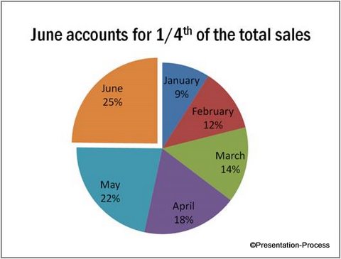
Consider this alternative pie chart:

Audience can find all the relevant information in one place instead of having to search around the slide. The slide title gives the core message. The relevant part of the pie chart is isolated for easy reference. So, your audience ‘gets’ your message under 2 seconds.
3. Make your key point stand out
Take a look at this slide with data:

Can you tell what the key message of the slide is? Neither can your audience. Slides without a clear focus take a long time to understand. You can read further tips for data presentation here.
Consider this alternative slide with graph:

The key point almost jumps out of the slide. To make presentation of data effective, we ruthlessly removed everything that can potentially distract the audience attention. There are no grid lines. Units on the y axis are replaced by data labels. The key number is made larger than the rest. Naturally, your audience gets the message under 2 seconds.
4.Don’t spread your audience attention
Take a look at this slide with a line chart:

Every piece of data presented on the chart demands a portion of your audience attention. That is why busy charts with multiple data sets put a lot of stress on your audience.
Consider this alternative line chart:

We retained just the two data sets required to make our point. The rest is dimmed out. This channelizes the audience attention to where it matters. This is a very effective way to get your point across in less than 2 seconds, when your chart has a lot of elements. Presentation of data with simple animation makes data powerful.
5.Use callouts where required
Using callouts is quite effective to draw the attention of your audience to multiple areas of your chart. It is advisable to use custom animation to show the callouts one at a time.
In the example below, we used callouts to highlight 4 different aspects of the chart:

In each case, we retained just the relevant information and dimmed the rest.
Summary of the tips to make effective presentation of data in 2 seconds:
- Use simple 2D charts instead of complex 3D charts
- Use labels instead of legends
- Make your key point stand out
- Don’t spread your audience attention
- Use callouts
These 5 simple tips will help you get your message across in 2 seconds or less.
Smarter options for business presenters:
If you don’t have the time to think of and create graphs in PowerPoint you can take a look at our Data-Driven PowerPoint Graphs Pack. We have done all the hard work for you. The pack not only has the regular bar,pie, column and line charts readily available for your use, but also has tons of data-driven infographics to help you get across your business information easily.
Take a look at some of the pre-formatted Graph templates from the pack:
Pareto Graph Showing Cumulative Percent & Benchmark

Dual Thermometer Graphs – Just enter your data to use

Charts Showing Proportion Across 2 Years from Graphs Pack
 These graphs are surprisingly easy to use and don’t require any additional software or extensive PowerPoint knowledge. You just need to copy our graphs to your slides and replace your data in the worksheet.
It is so easy to present insights to audience with such graphs.You can now do away with confusing excel sheets and tables.
Please do browse through the gallery of 320+ high-quality graphs for business presenters here >>
Related: Read Creative Ideas for Data Presentation
Return to Top of Presentation of Data Page
