Home > Presentation of Data > PowerPoint Graphs
Who says your PowerPoint Graphs need to be boring? Discover a simple way to spice up your graphs so that they tell a story that will engage your audience.
Context:
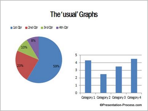
Most graphs and charts in PowerPoint presentations look the same, irrespective of their subject and context. When your audience sees ‘usual’ charts like these, they naturally tend to get bored:

Is there a way to make your charts look livelier and tell an interesting story?
Yes. A simple way to breathe life into your graphs is to ‘fill’ certain segments of your graphs with textures and images. Here are 4 different examples from a range of industries:
Creative Data Driven Pie charts:

This could easily have been just another pie chart. But, we wanted to add some context to the numbers. So, we did the following:
- Since the chart is about ‘Market share of a specific brand of cycle tires (or Tyres)’ in a city, we used the image of a cycle tire to serve as the base
- We placed our pie chart on top of the image to align with the inner rim of the wheel
- We made the pie chart segment related to ‘Our Brand’ as 100% transparent ( Fill> No Fill), so the spokes in the wheel could show through
- We added relevant call outs to give context to the numbers
- We added an asphalt road beneath the tire for effect
Since ‘Our Brand’ holds major share of the market, our visualization conveys a subtle message that we make the market move forward.
Example from Food industry:
Let us assume, we want to convey the same message in the previous example in some other industry. Here is our creative option for Food industry:

Instead of making the segment related to ‘Our Brand’ as transparent, we filled it with the texture of a cookie. To enhance the visualization even further, we added the image of some cookie crumbs next to the chart.
Don’t these PowerPoint Graphs look better with some added creativity?
Related: 5 Tips for Better Data Presentation
Conveying Sales numbers with Column Chart:
You can show creativity in any type of chart you use. Take a look at the following example:

This could have been the ‘usual’ column chart your audience is bored with. We made the following adjustments to bring the chart to life:
- We increased the width of the columns by reducing the gaps between them
- We used ‘Fill Picture’ option to fill the columns with a ‘Building’ texture downloaded online
- We removed Y- axis and Gridlines
- We added data labels to indicate the numbers
So, we transformed a boring chart into an interesting info graphic in just a few seconds!
Related: Tutorial: Creative data-driven Thermometer
Here is an example from Pharmaceutical Industry:
We used the image of a pill to stack up the columns.

So, with a bit of imagination you can make your charts come alive. The key is to apply relevant visualization.
Related:2 Rules for Clarity in Charts
Variations in Data Driven PowerPoint Graphs:
We wish to show you some interesting variations in data driven graphs. The graph templates are from our ‘750+ PowerPoint Charts & Graph Templates pack for CEOs’.
Source: Editable Charts from PowerPoint CEO Pack
Source: Data-Driven PowerPoint Waterfall Chart from CEO Pack
Source: Data-Driven PowerPoint Line Chart from CEO Pack
All the 793 diagrams in the pack are fully editable. You can change the color, size, shape and elements in the diagrams to suit your specific requirements.
If you are a business presenter, the graphs in the pack will not only save your time, but also inspire you to come up with your own variations to make your message effective. Why waste time creating charts and graphs from the scratch, when you can copy our graphs to your slides and replace dummy data with your own data in minutes.
You can view the details and get the CEO pack for yourself here >>
Related: How to create a Designer Pie Chart
Related: Where to get ideas for creative charts & graphs
Return to Top of Do Your PowerPoint Graphs Tell a Story Page


