Home >All PowerPoint Tutorials> PowerPoint Animation> PowerPoint Chart Animations
Here is an interesting twist to the usual Animation for PowerPoint Charts. Discover the power of combining multiple custom animation options to create stunning results.
Where can you use this animation effect?
The effect is useful when you have to show multiple line graphs in one chart.
While any good custom animation can help you present information in easy incremental steps – this powerful combination of animations makes your message far more memorable. Let us learn to create this effect in a step by step manner:
Step 1: Create the basic line chart
Use Insert -> Charts -> Line chart tool to create your basic line graph.

Step 2: Insert a ‘hand and pen icon’
![]() You can save the above icon (Right Click on it and Save As… to your desktop) or find any icon which shows a hand with pen. You can find them easily on the net for free.Insert the icon right above the line you want to animate. Let the tip of the pen touch the starting point of the line graph.
You can save the above icon (Right Click on it and Save As… to your desktop) or find any icon which shows a hand with pen. You can find them easily on the net for free.Insert the icon right above the line you want to animate. Let the tip of the pen touch the starting point of the line graph.

Step 3: Animate the chart and objects
A) Wipe animation for the line graph
First use ‘Wipe animation’ for the chart. Right click on the chart -> Animation -> Custom animation -> Wipe -> Direction – left to right.

Once this is done, go to ‘Effect options’ sub menu. Go to ‘Chart animation’ tab. Animate the chart by series. This will first animate the background and then the line.
B) Fade and Custom motion path animation for the icon
Right click on the hand icon ->Animation -> Custom animation ->Fade. Let the speed be ‘fast’.

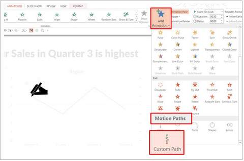
Then, select Motion path animation and in that choose ‘custom motion path’ option. Trace the line graph to create the path for animation. This will make the hand icon to move along the path of the line graph.

Related: Creative Motion Path Animation Tutorial
C) Sequence the animations
The next step is to sequence the animations.
- First let the chart background with axis appear ‘on click’. This will allow you time to present the context of your graph to your audience.
- Then, let the hand icon appear with fade effect ‘on click’. Let the motion path animation appear ‘after previous’.
- Finally, let the wipe animation of the line graph appear ‘with previous’. Ensure that the speed of the wipe animation and the motion path animation are the same.
If you check your Animation Pane, the animation sequence would appear as follows:
The final result is the PowerPoint Chart animation sequence as below.
So, by combining a couple of simple animations you can grab the attention of your audience instantly. Another way to make stunning impact with your data presentations is by using professional chart templates.
Related: Animate your PowerPoint Table
Options for Data Driven PowerPoint Chart templates:
Here are some chart templates from our Visual PowerPoint Graphs Pack
The templates combine the visual capabilities of PowerPoint with spreadsheet capabilities of Excel (embedded in PowerPoint) to create stunning results. To edit the charts, you just need to replace sample data with your own data in the embedded worksheet. The charts update themselves automatically.


Source: Chart Placeholders from Visual Graphs Pack


Source: Step Charts from Visual Graphs Pack
The pack has a wide range of fully Data-Driven PowerPoint graph templates for business presenters.
If you are a business presenter who needs to make high stakes presentations – the pack is a useful investment for you. Please browse through the sections and add useful templates to your presentation resources.
