Home > Presentation Design > Pictures vs Text in PowerPoint
Are pictures better than text in PowerPoint? See where each of them fit in a slide deck when you make business presentations.
Are Pictures better than text in PowerPoint?
We’ve all heard the saying “A Picture is worth a thousand words”. We’ve also seen enough of Zen slides that have full page photos with a line of text in the corner.

The question is – should you always prefer pictures over text for your PowerPoint slides? No. Here are some thoughts on the topic:
When is Text better than Pictures on a slide?
- For checklist, agenda and summary slides
- To write a quote or definition
- To write rules or instructions which may then be printed out and distributed
The issue is not about having text on the slide, but having full sentences on the slide (unless they are quotations) that make the presenter irrelevant.
When is it better to have Pictures than Text on a slide?
- To show a person, place or event
- To evoke audience emotions
- To serve as a visual backdrop when you elaborate an abstract idea
The issue is not about having pictures on the slide, but about having pictures that hijack audience attention away from the topic of the presentation.
Related: 5 Wrong Ways To Use Pictures In Powerpoint
Diagrams and Charts are better suited for a business presentation:
The best way to approach a business presentation is to use a judicious combination of both pictures and text. Diagrams seamlessly blend visuals with text. They help audience visualize the relationship between ideas easily. Take a look at the following examples:

The timeline you see above is nothing more than text arranged in sequence. The diagram helps your mind to put the text in context. Let’ see another example:

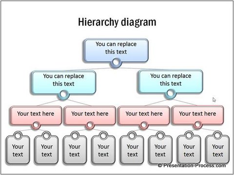
This hierarchy chart helps you visualize the various positions in an organization in terms of their levels. Some diagrams go the extra mile to use a metaphor to lend meaning to text. Here is an example:

Find more such metaphors in a ready to use format from our PowerPoint Graphics and Concepts CEO Pack 2 here >>
These diagrams are visual enough to make your message memorable, yet they don’t hijack your audience attention. They allow you to remain the leader of your presentation, while making your job easy to convey your ideas.
When you use diagrams in your business slides…
- You don’t risk sounding ‘vacuous’ in a boardroom (which is always the risk in using Zen style slides)
- You won’t see sleeping faces in your audience (which is the risk with those text based slides)
- Your message is remembered and you are remembered too as the carrier of that message
If you really want to take your diagrams to the next level, you should use ‘ custom animation’ purposefully to unravel your message in incremental steps. Here is a useful article that gives you more thoughts on the subject.
Easy way to create visual presentations:
Diagrams and Charts are time intensive to create. If you are a busy business presenter, you can always use ‘off the shelf solutions’ like PowerPoint CEO Packs to make your slides visual and memorable.
The two CEO packs have more than 1600 premium charts, graphs, diagrams and graphics to help you visualize every business idea imaginable.
Please browse through our diagrams collection and see how the packs can change the way you create your business presentations forever.
If you liked this article on Pictures vs Text in PowerPoint, do browse around our site. You will find 500+ articles and tutorials on Presentations and PowerPoint.
Related: 5 Best Practices from Web Design for a PowerPoint Designer

