Home > All 2010 2007 Tutorials > Infographics> Pictographs in PowerPoint
Find a simple 3 step tutorial to convert your boring column or bar charts into interesting graphs with pictures. Discover creative ideas to spice up your data presentations.
A quick word about Pictographs:
Pictographs make mundane and boring charts look interesting by using relevant imagery. You see them all the time in magazines, newspapers and websites. Good infographs have the power to draw the attention of readers/ visitors and make the message memorable. Here is an example…
Example of Using Pictograph:
Let’s say a local newspaper wants to show the number of wine bottles sold in the last 6 months. A regular column chart would display data like this:

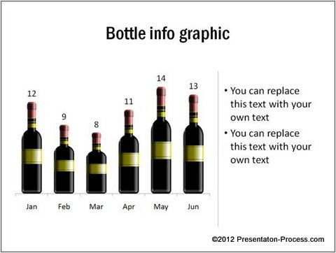
The chart is boring. So, most readers would turn the page without bothering to read the rest of the article. If the same information were to be shown as a pictograph, the chart becomes quite interesting:

Source: Pictographs from Visual PowerPoint Graphs Pack
If you think that it takes a lot of hard work to convert column chart into pictographs in PowerPoint, you are mistaken. In fact…
Creating Pictographs in PowerPoint is surprisingly easy:
Here are three simple steps to turn a boring column chart into an interesting pictograph:
Step 1: Draw the usual column chart
Let’s take a column chart that shows number of new apartments constructed in the last 3 months in an area. The chart shows figures in thousands:

 Step 2: Copy a relevant image
Choose a relevant image you want to fill in the columns. When you click on the image and press ‘Ctrl+C’, the picture gets copied to the clipboard. Let’s take the image of a residential building to ‘copy to clipboard’.
Step 3: Select the columns and paste the image
The next step is to click on the columns. When you click once, the entire series gets collected. When you click again only a single data point in the series gets selected. Let’s select the series by clicking once on the chart columns:

Now press ‘Ctrl+V’ to paste the image. Voila! Your boring column charts turn into interesting pictographs in PowerPoint instantly. This is the resulting graphic:

Now, you can spice up your boring business reports in no time.
Related: Create your own editable 3D Column Chart
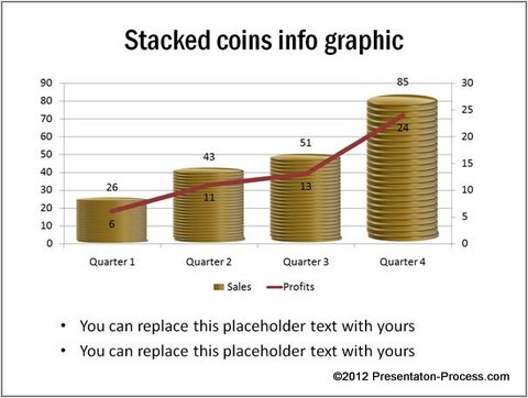
A financial report that shows sales and revenue can look like this:

Your performance dashboard can display sales figures of different sales people like this:

See More Performance Comparison Charts from Visual Graphs Pack
Go ahead and let your charts shine by using this simple method to create pictographs in PowerPoint.
Useful resource for business presenters:
While it is easy to spice up simple column charts or bar charts, it is not easy to create more sophisticated charts without spending a lot of time and effort.
What if you could create remarkable visual charts like – thermometer chart, bullet chart, speedometer chart, Gantt chart, Pareto chart etc. as easily as you created pictographs here?
What if you had access to professionally designed data driven chart templates where you could just replace sample data with your own data and see the charts update themselves automatically?
Seems useful…doesn’t it?
Click here to take a look at our Visual PowerPoint Graphs Pack The pack has more than 320 business relevant data driven readymade PowerPoint Graph templates for busy business presenters like you. Here is a quick preview of some of the templates from the pack.
Related: Create A Dramatic Battery Diagram in PowerPoint
Return to Main Presentation Infographics Section
Return to Top of Interesting Pictographs in PowerPoint Page

