Home > PowerPoint Charts> Infographic
Create amazing PowerPoint Info graphic using Pencil icon. Follow our simple step by step instruction to create this useful diagram.
The Infographic you’ll learn to create is:

Where to use Info graphics in PowerPoint?
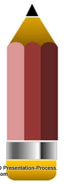
You use them when you want to represent your information in a creative and visual way. They make your message memorable and effective. Most information-oriented graphics are created by repeating or resizing basic elements related to the subject. In the example above, we showed the amount of investment made in primary education, with a simple pencil icon shown here:

Related: Why presentation graphics
Let us build the pencil icon from bottom up in a step by step way.
Step 1: Draw the eraser at the base:
Go to Auto shapes -> Rectangles -> select ‘Round Same Side Corner Rectangle’ tool.

Draw the shape, turn it over by using Align> Rotate> Flip Horizontal option and fill it with a color of your choice:

Step 2: Draw the metal ring
Use Rectangle tool from Auto shapes menu to draw a rectangle along the top edge of the eraser you just created. Right click on the shape; go to Fill -> Gradient Fill -> Preset colors -> Chrome II.

The result will be as follows:

Step 3: Draw the body of the pencil
Again select the ‘Rounded same Side Corner Rectangle’ tool as we did in the first step. Then, pull in the diamond handles till you have a nice curve and increase the height of the PowerPoint Shape.

Draw three vertical bars along the top edge of the metal ring. Make sure that the top edges of the bars are fully rounded. Leave no gap between the bars as shown here:

Remove the outlines with Right Click> Format Shape> Line Color> No Line and Fill Color for the three bars with the same color, but with increasing intensity as follows:

The result of the fill color will be as follows:

Step 4: Draw the wooden tip
Go to Auto shapes menu, choose ‘Trapezoid’ shape.

Draw the shape on top of the body. Fill it with appropriate color and send it back:

Step 5: Draw the lead
Finally, go to Auto shapes menu, select ‘Triangle’ shape. Make a small triangle; fill it with ‘black’ color and place it on top of the trapezoid shape. Your pencil icon is ready.

Resizing the icon to create the infographic:
To create pencils of varying height, you just need to extend or reduce the length of the pencil’s body, while keeping the top and bottom portions constant. It is easier to vary the lengths of the three bars by grouping them together ( Ctrl+ G).
Once you draw as many pencils as the information you want to represent, write the labels to make the numbers obvious:

We drew thin grid lines in the background to give the feeling of a sheet from a student’s notebook.
Related: Do your graphs tell a story?
Variations of infographics in PowerPoint:
We wish to show you some interesting options in our data-driven graphs collection to give you an idea of how you can represent your data in an interesting and memorable way with diagrammatic graphs.
These Graph Templates are part of our ‘320+ Visual PowerPoint Graphs Pack.
Data-Driven Bottle Infographic

Pills Pictogram from Graphs Pack

Source: Pictographs from Visual PowerPoint Graphs Pack
Data-Driven Hand Drawn Min Max Column Chart
 Source: Hand-Drawn Charts from Graphs Pack
All the 320+ graph templates in our CEO pack are data-driven using the regular worksheet function in PowerPoint. With tons of creative ideas and stunning graphs, the pack will help you make a lasting impression in your audience’s mind. If you are a business presenter, we urge you to take a look at our graphs gallery here >>
Related: Creative Presentation Ideas for Data Presentation
Related: Effective presentation of data
Return to Top of Infographic Page
Return to Main PowerPoint Chart Page
Liked this presentation? Share it with your friends here…
