Home > PowerPoint 2010 Tutorial> Charts in PowerPoint 2010
Discover a useful formatting tip for charts. Show negative values in your PowerPoint column chart in a different color with a single click.
Useful feature for Charts in PowerPoint:
There are times when you want to show negative values in a data series using a different color. Up until 2007 version of PowerPoint, this task was quite difficult. Now, PowerPoint 2010 & 2013 offer a useful feature to apply simple conditional formatting to charts with a single click. For example, take a look at this column chart:

The negative bars are in red color while the positives are in green. In this article, we will show you how to achieve this in a simple step by step way.
Step 1: Draw your column chart
The first step is to create your column chart using Insert -> Chart -> Column.
 Click on a column in the chart area. This will select all the columns. Choose a shape fill color option.
In our case, we chose green color to fill the bars:

Step 2: Invert Color if Negative
The next step is to fill the negative values in a different color. Right click on a bar. Go to ‘Format Data Series’-> Fill. Check on the box next to ‘Invert if negative’. A new drop down tab appears for Fill color as follows:
 The tab on the left is to fill color for positive values and the tab on the right is to fill color for negative values. We chose Red color for negatives and the chart now looks as follows:
 So, in one click you can now apply basic conditional formatting to your charts.
Related: PowerPoint Reflection Effect
Caution:
This feature works only inside PowerPoint 2010 & 2013. If you open the file in PowerPoint 2007 version you won’t find the conditional formatting you applied in your 2010 or 2013 version.
Smarter Alternative for business presenters:
If you make critical business presentations frequently and you don’t have the time to experiment with the various tools in PowerPoint to format your charts, we have an elegant solution for you. We recommend you take a look at our ‘Visual PowerPoint Graphs Pack’. The pack has more than 320 business relevant chart templates in PowerPoint that are fully data driven.
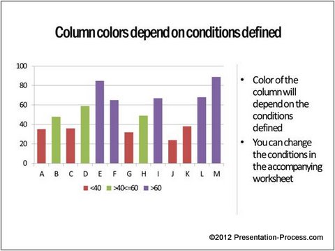
Here are some chart templates from the pack with conditional formatting. These charts work well in any version of PowerPoint.

Source: Winners and Underachievers from Visual Graphs Pack

 There are a lot more options in the pack to suit your specific needs.
Editing the charts is surprisingly easy. Right click on the chart -> select Edit data. A worksheet opens up. Replace sample data with your own data. The chart updates automatically. It’s that simple.
You don’t even have to type in the numbers in the worksheet. You can copy paste data from your own excel file. Creating sophisticated charts has never been easier or faster in PowerPoint.Please take a look at this demo page to see how easy it is to edit chart templates from our pack.
So, why waste time constructing your charts from the scratch when you have such a high quality solution available off the shelf?
Browse the PowerPoint Graphs Pack here>
