Still Using the Design Themes in PowerPoint? Read this before your next presentation…
Do you know that using design themes in your presentation can put you at a serious disadvantage?
Here is what the content slides look like in the Default design themes available in PowerPoint.

How many times have you seen these same design themes in presentations you have attended? We’ve seen them in almost every presentation!
It is the same with your audience. Design themes in PowerPoint are so overused by presenters that they have become cliched. Audience get used to seeing the same design theme over and over. So by the time they see your first slide, they are already bored!
Apart from this, here are 3 restrictions imposed by design themes on your freedom of expression on your slides.
#1 Reduced slide space due to pointless design elements:
As a presenter, you always want to take full advantage of the slide real estate. After all, the more space you have available on your slide, the more freedom you get to express your ideas.
However, using design themes for your presentations severely restricts the amount of space available for your content.
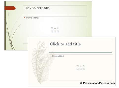
For example, take a look at the space available for you content in one of the design theme options:

Here is another design theme background:

Can you see your freedom being squeezed out by the pointless design elements on your slide?
When you try to work with the restrictions, you end up using smaller fonts – which affect the visibility of your text to your audience
Your diagrams and charts have less space to be projected. This means – you would resize them to reside within the space available on the slide. This automatically means the text elements inside your charts, tables and diagrams are going to get resized too. This affects the readability of your content.
#2 You are forced to use just bullet points on your slides
Do you realize that most of the design themes assume that your presentation will have nothing more than bullet points on your slide?
For example, take a look at some of the design themes below:

These swirls and feather designs will look totally out of place when you try to include a chart, a map, a diagram or a table on your slides.
So, when you choose such design themes you are forced to stick to just bullet points on your slides. Needless to say, your audience will hate you for such boring presentations.
#3 Restricted color choices
Many of the design themes come with their own slide backgrounds with bold colors. Take a look at some of the examples below:
 The moment there is a strong color in the slide background, your choice of colors for your charts and diagrams get severely restricted.
You can’t use isolated images with white backgrounds on your slides, because they stick out like a sore thumb.
Your get very few choices for your visuals. So, you spend more time searching for the images to match your design theme. This is a totally unproductive way of using your time.
So, using design themes is a seriously bad idea for your business presentations.
Your best option is to use a blank slide as your background. You will have complete freedom to build your slides the way you want.
However, there are some really smarter and creative ways to use your design themes to enhance the look and feel of your slides. Take a look at some of the title slides we designed:

Source : Flat Design Pack for PowerPoint

These slides look fresh and beautiful and can be reused for almost any type of business presentation. You can replace the images to customize them to your presentation topic! There is no default and boring content slide background that gets added. So you need not worry about that aspect of your presentation!

Source : Flat Design Pack for PowerPoint
These templates can be used in almost any presentation software – on Keynote, PowerPoint, Google Slides or Open Office software.
Click here to know more about the Flat Design Pack for PowerPoint
Hope you found this article useful! Do leave a comment below…
