Home > Presentation of Data Page> 5 Data Presentation Lies
Who says numbers speak for themselves? Here are the 5 BIG lies in data presentation you should watch out for.
Case 1: Revenue Growth
Take a look at this company revenue growth chart:
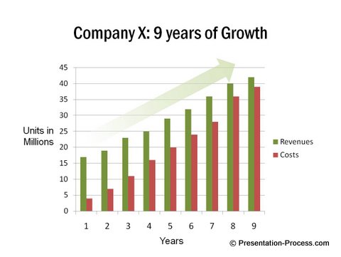
If you were thinking, “Wow! The revenues of the company have been growing consistently for the past 9 years. The slide title and the green arrow say it all. It is the right company to invest in” – then, STOP.
Take a closer look at the numbers. You’ll begin to see the ugly side of the chart.
Here is the ugly truth behind the same data:

The presenter decided to mention just the convenient truth. If you had not been careful, you would have fallen for the data presentation lie. You can read about more presentation tips to avoid here.
Presenting Data Caution 1: What is not said is as important as what is said
Be clear about the information you want to see and demand the information you need to make a decision.
Case 2: Comparison to Competition
Take a look at this data slide presented by a popular magazine:
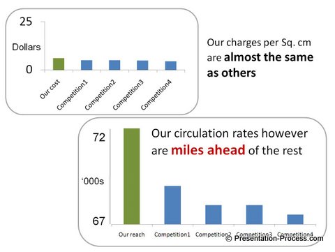
If you are business owner looking for a good medium to advertise, the slide makes you think, “That is a convincing argument. They talked about the two numbers that matter to me. The charts are self explanatory.
The rates seem to be the same as any other magazine. The difference in circulation however seems stunningly significant. I would be missing a golden opportunity if I don’t go with them for my next advertisement”
Stop! Take a closer look at the chart.
Here is the ugly truth behind the data:
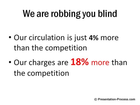
How did they manage this data presentation lie?
Quick analysis of the data presentation:
Their charges are $6 per sq.cm. The competition charges $5 per sq.cm. The difference of $1 per sq.cm. is huge if you go for big advertisements. They downplayed the difference by widening the interval in the y-axis. When the interval is as wide as 25 units, $1 difference (18% more expensive) goes unnoticed.
In the chart on circulation, they made a small difference of 3000 prints look sizeable. They did this by using very small intervals in the y- axis and narrowing the chart range (Minimum 67,000 and Maximum 72,000).
Presenting Data Caution 2: If some claims are too good to be true, they usually are
I recommend you ask basic questions and understand the axes.
Case 3: Change over Time
See the extent of manipulation in the following presentation slide made by a political party:
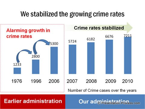
Did the political party actually arrest the growing crime rates?
Here is the ugly truth behind the same data:
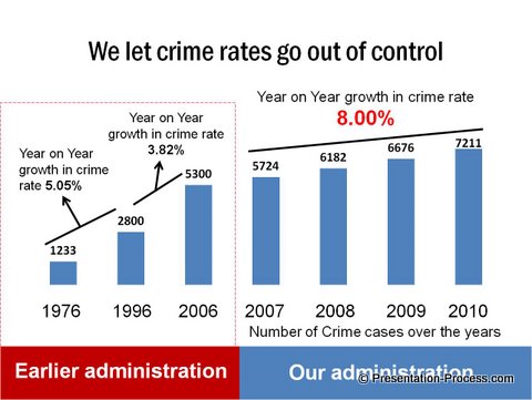
In fact, the crime rate has more than doubled in the new administration compared to the old administration. If you were an unsuspecting audience you would have fallen for the data presentation lie.
How did they manage to fool you?
They manipulated the timeline. The time span between the first two bars is 20 years and the time span between the next two bars is 10 years. The bars that follow conveniently plot each year’s crime numbers. No wonder the jump is sharp in the first two cases compared to the latter cases!
As a presenter, you can read about effective presentation of data here.
Presenting Data Caution 3: When you see sharp changes in a chart, look deeper into the numbers
Case 4:Sales Performance
What do you think of the sales performance shown in this data slide?
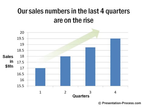
Did I hear you saying – “Wow! This performance calls for a celebration.”
Hold on a minute before you celebrate. We asked for performance numbers for the previous 4 quarters and the ugly side emerged.
Here is the ugly truth behind the same sales data:
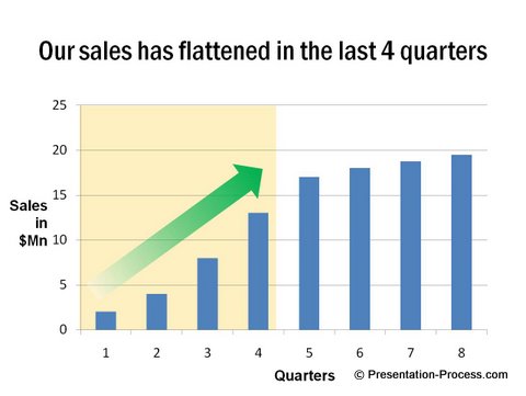
There is actually a stagnation in sales that needs to be scrutinized. The presenter almost pulled out a pizza from your wallet to celebrate.
Presenting Data Caution 4: Don’t judge data in isolation
Always use relevant and correct comparisons before making your evaluations. Demand to see the full picture.
Case 5: Standalone data
Look at this slide which complains about the rising number of damaged units:
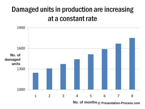
The situation looks quite grim, doesn’t it? You feel like initiating a major operation to clean up the product setup.
But, wait till you see the other side of the story as well. See the production figures for the same period:
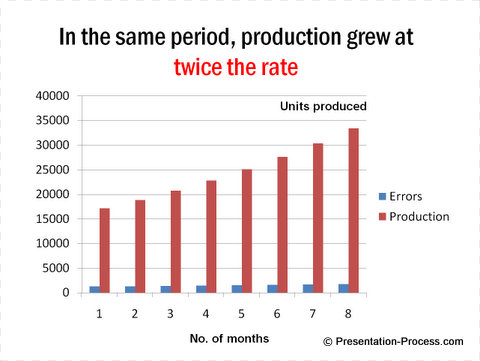
So, the error rate is increasing at a lower rate than production rate, which is a good thing. This actually calls for celebration instead of serious action.
Presenting Data Caution 5: See the complete picture from all angles before making your judgment
Conclusion about Data Presentations:
These examples were not meant to make you pessimistic. They were just meant to remind you to ask for the truth behind when you see a data presentation as an audience.
If you are a presenter, it may be easy to lie in data presentation. But, once you lose audience faith, it is impossible to get it back.
Related: Top Irritating Ways to Animate Presentations
Related: 5 Small Mistakes in Presenting Data
Return to Top of Data Presentation Lies Page

